Kodiaks news hub
Highlights


We Have Re-Branded
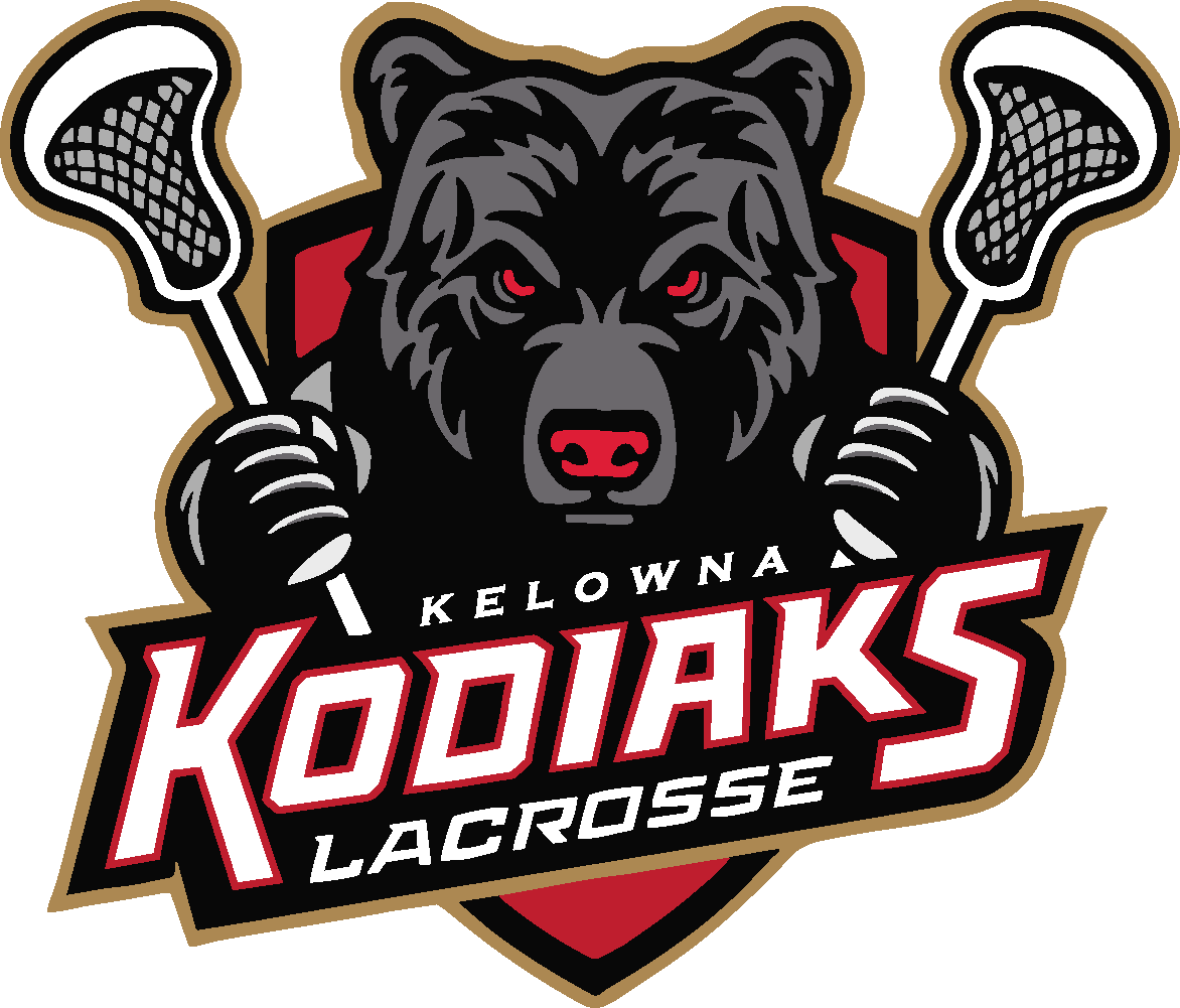
The Kelowna Junior Kodiaks are proud to unveil a bold new brand direction as we kick off the 2025 season!
Anchoring this initiative is a new team logo that features a strikingly re-imagined representation of the iconic Kodiak bear that has served as the team’s identity since returning to the league in 2021. This powerful new rendition – designed by one of our very own bench staff, Gregg Parrent – serves to embody the unrelenting spirit of our players and the relentless energy they bring to the floor.
The new color palette of black, grey, and red was chosen to evoke strength, determination and grit, while clever use of rich gold accents lend a touch of prestige and power to our messaging.
In undertaking this initiative, we felt it was the perfect opportunity to incorporate something that would honour the heritage of game. The result was a secondary brand icon consisting of a bear paw graphic with the outline of a maple leaf subtly nestled within its design.
Recognized as one of Canada’s first national sports, lacrosse has deep Indigenous roots and has long been a symbol of community, endurance, and cultural tradition. By incorporating the maple leaf into the overall brand, we pay tribute to the enduring legacy of the game and those who played it long before us.

